Matte vs Glossy Photos: Our Paper Types Explained
By Photobox on 29 December 2025
Here’s everything you need to know about our paper finishes.
Matte or gloss photos, gloss or matte photos… choosing the right paper can make all the difference to your creation, so it helps to understand which styles are available and the effect each one creates.
This guide is here to explain all of our paper options, from the look and feel of our standard finish to the difference between gloss and matte photos, so you can choose the perfect match.
Matte
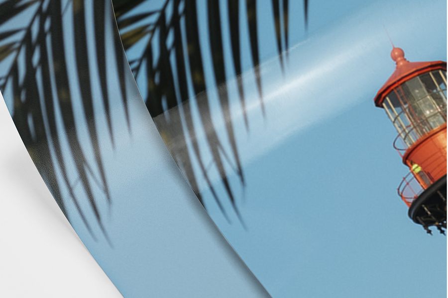
A matte finish is available for our prints. It gives your snaps a smooth, frosty look and feel, perfect for softer tones and muted colours.
When it comes to matte photos vs glossy, matte isn’t as intense, but it won’t suffer from any glare, so your photo product can be enjoyed from any angle.
Glossy
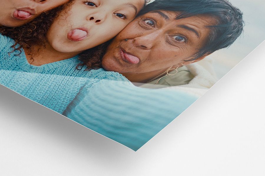
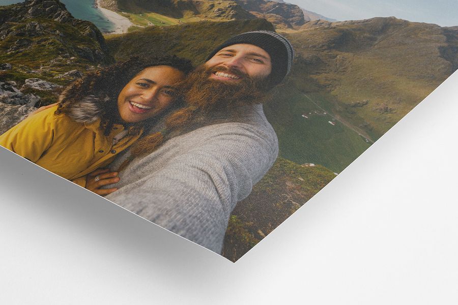
A glossy finish is the most common result when developing photos, achieved by applying an extra reflective varnish-style coating to the photo paper. The result is a sleek and high-shine print, making every colour vibrant and every detail pop. If you’re exploring gloss or matte finish photos, glossy is the high-impact option.
Something to note about gloss vs matte photos is that glossy reflects more light, and the delicate printing is sensitive to fingerprint marks. But if you want bright, bold, eye-catching images, go for glossy.
It’s available as an option for all prints, and as an upgrade for photo books, calendars, posters, and cards.
So, gloss or matte photo prints?
A recap of the main differences between gloss and matte photos
- Glossy reflects light, matte doesn’t
- Glossy makes colours vibrant, matte is ideal for muted and softer colours
- Glossy feels polished, matte feels frosted
There’s no right or wrong answer when it comes to choosing matte or gloss photos – it’s all about what you prefer. Think about where your photo product will live, how you plan to use it, or who you’re gifting it to. These small details can help guide you towards the perfect finish.
Our other paper finishes
Classic satin – the balance between gloss or matte photos
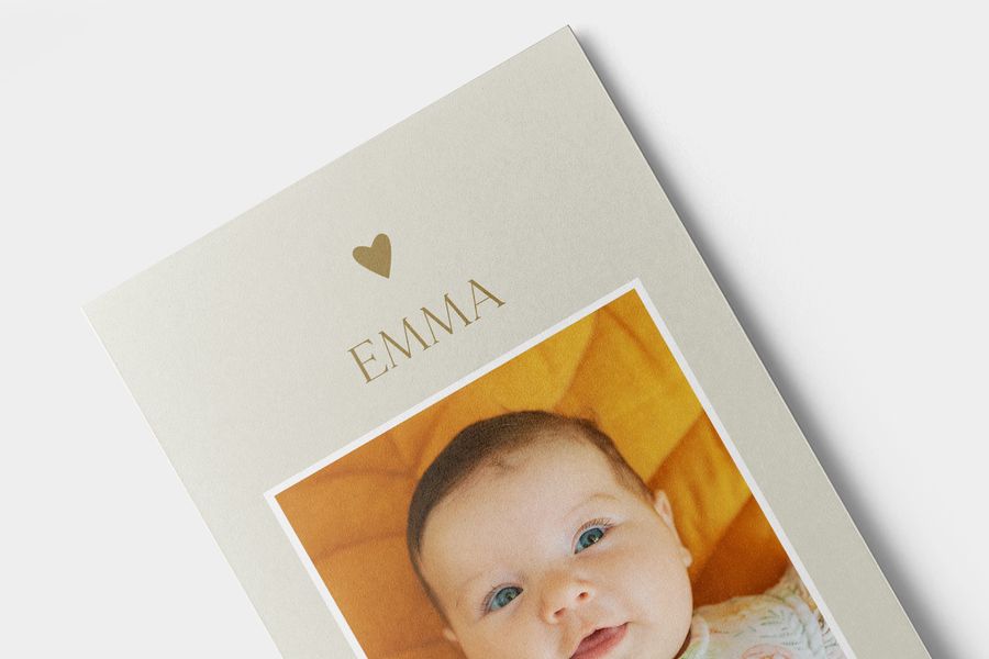
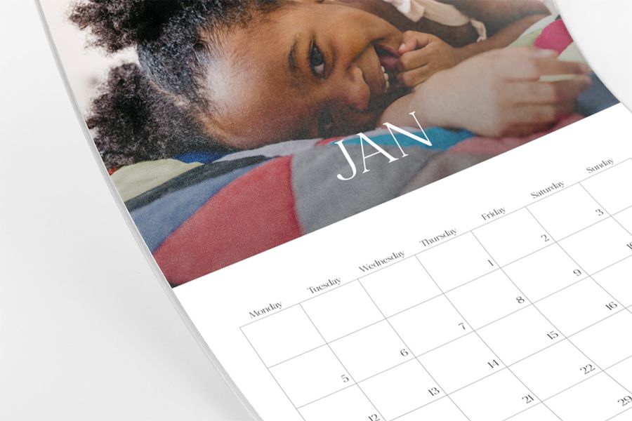
Classic satin is how we describe the standard paper finish for our photo books, calendars, posters, and cards.
Classic satin gives your creation a smooth texture, and brings out the rich colours in your snaps. It’s a little matte, a little glossy – that’s why it’s our go-to option, no matte vs gloss photo debate needed.
Extra matte
This finish is available for our calendars, posters and cards. Opting for extra matte means we’ll print your creation on crisp, white, uncoated paper. This makes the colours in your photos extra vibrant.
It’s especially great for posters since it won’t reflect natural or artificial light in a room – ideal if you’ve been weighing up matte vs glossy prints for your wall art. Extra matte is also the perfect texture if you plan to physically write on your creation, whether adding a handwritten message to your cards, or jotting down events on your calendar.
The very best quality, every single time
Whether you choose matte or gloss finish photos or another finish, what you can count on is a beautifully printed result. As experts in photo printing, we never compromise on quality. Every product is printed with care to ensure a stunning look that lasts.