Easy ways to refresh your home
By Photobox on 29 March 2023

So, how do you showcase your photos?
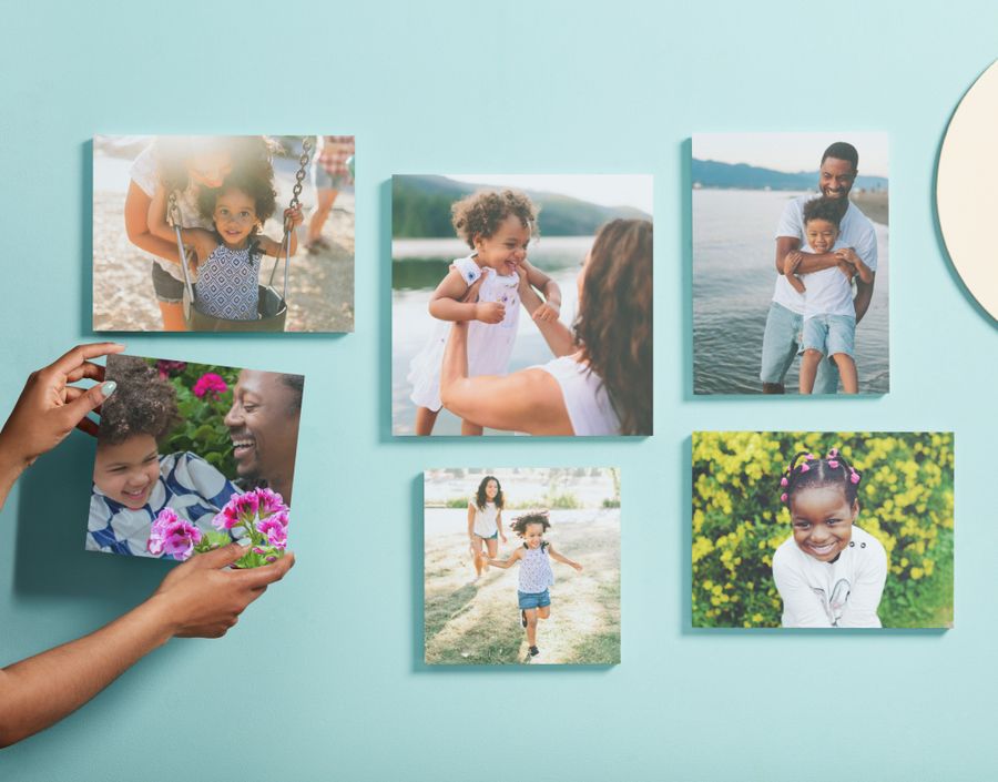
Make a personal art gallery for your wall
Blank walls are far from inspiring, so adding some art is the way to go. Why not create a feature wall to make the room really *pop*? Whether you fancy gathering your favourite holiday snaps, curating a selection of professional copyright-free imagery, or even creating your own designs, a gallery wall can easily make a space bright and unique.
Our Photo Tiles are a great addition to your home decor shopping list. Available in 4 different shapes, framed or frameless, these tiles come with restickable adhesive tabs so you can get creative with your collage and reposition them with zero fuss.
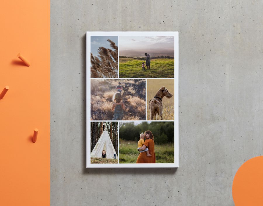
If you’re certain of your photos to display and fancy one stand-out piece, opt for a Canvas Print. With a choice of 16 sizes and up to 30 photos per canvas, this piece is *perfect* for displaying your absolute favourite moments, all in one place. Simply gather the images you want to include and lay them out in our Editor.
Add some unique decor to the shelf
Spring cleaning is all about giving the shelves a good dust. While you’re at it, why not brighten them up with some free-standing photos that remind you of the good times.
Our Acrylic Photo Blocks combine durability with a modern look – perfect for any space that needs an extra touch of personality. From iconic selfies to breathtaking landscape shots, simply choose from 10 x 15cm or 15 x 20cm, add your photo ,and we’ll print it out on 2cm thick acrylic. They also come packaged in a gift box, if you fancy surprising a loved one.
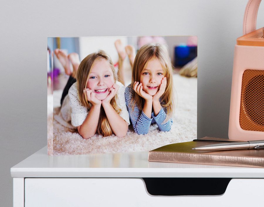
If you prefer a canvas material for your photo, choose a Desk Canvas Print. These prints are in a 20 x 20cm square format, so you can easily turn your Instagram posts into true works of art for your shelf.
Give your living space a personalised touch
Now that your walls and shelves are full of personality, it’s time to focus on some smaller bits of decor that truly make a difference.
Our Photo Cushions are the *cosiest* of all home decor pieces, and ready to display your favourite moments caught on camera. With a choice of either canvas or suede-effect, you can tailor your cushions to suit the aesthetic of your living room (we did say you’d be an interior design master after reading this).
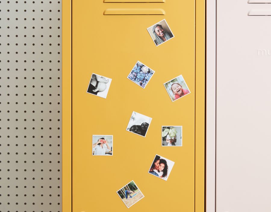
Let’s not forget the kitchen here – it deserves decoration too. Fridge magnets are an often overlooked kitchen accessory, but our set of 9 Photo Fridge Magnets are a great way of making you smile every time you reach for a snack.
Ta-da – your home has been given a personal and unique refresh, just in time for the warmer months ahead. Feeling the creative vibes? Head to Photobox and have a browse of even more decor pieces to give your home the extra love it deserves.